Table of contents
No headings in the article.
Hello everyone
Recently I was tasked with creating some components for a mobile app and one of the component is a progress bar, after looking at the designed component i decided to come up with a simple implementation instead of installing package to handle the progress bar for me.
you can skip the step by step implementation by checking out the sample implementation on expo
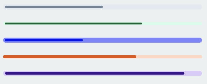
This is a picture of what I will be implementing.

Building the progress bar
Tech stack: React-native & Styled-components
Looking at the image above the progress bar contains 2 element
- the outer container
- a line to indicate the progress
implementing the progress-bar component
const ProgressBar = (props) =>{
  const {
       progress,
       height = 8,
       outerBackgroundColor,
       innerBackgroundColor,
       padded = true
  } = props;

  return null;
}
Implementing the progress container:
import styled from 'styled-components/native';

<Container
    height={height}
    padded={padded}
    outerBackgroundColor={outerBackgroundColor}
   >
 {/* the line indicator goes here */}
</Container>

const Container = styled.View`
  width: "100%";
  borderRadius: 16;
  alignItems: flex-start;
  justifyContent: center;
  height: ${props => props.height};
  backgroundColor: ${props => props.outerBackgroundColor};
  paddingHorizontal: ${props => props.padded ? 3 : 0};
`;
Explanation:
The outer container is a line with a configuarable height, this will act as a container for the inner line which is the actual progress; the props passed to the container includes:
- height: this is the height of the progress bar
- padded: a props to show if the progress bar should be padded or not
- outerBackgroundColor: this is the color of the progressbar container.
Implementing the progress content
import styled from 'styled-components/native';

<Content
      height={height}
      padded={padded}
      progress={progress}
      innerBackgroundColor={innerBackgroundColor}
/>

const Content = styled.View`
  borderRadius: 16;
  height: ${props => props.padded ? (props.height / 2) : props.height};
  backgroundColor: ${props => props.innerBackgroundColor};
  width: ${props => props.progress}%;
`;
Explanation:
The inner content is the progress indicator that takes in several props
- height: this is the height of the progress indicator, (if the progress is padded then the displayed height is half of the height passed into the content)
- padded: a props to show if the progress bar should be padded or not
- progress: this is the progress width (0 - 100%)
- innerBackgroundColor: this is the progress color.
Full Code: link
import styled from 'styled-components/native';

const ProgressBar = ({progress, height = 8, outerBackgroundColor, innerBackgroundColor, padded = true}) =>(
  <Container
    height={height}
    padded={padded}
    outerBackgroundColor={outerBackgroundColor}
   >
    <Content
      height={height}
      padded={padded}
      progress={progress}
      innerBackgroundColor={innerBackgroundColor}
    />
  </Container>
);

const Container = styled.View`
  width: "100%";
  borderRadius: 16;
  alignItems: flex-start;
  justifyContent: center;
  height: ${props => props.height};
  backgroundColor: ${props => props.outerBackgroundColor};
  paddingHorizontal: ${props => props.padded ? 3 : 0};
`;

const Content = styled.View`
  borderRadius: 16;
  height: ${props => props.padded ? (props.height / 2) : props.height};
  backgroundColor: ${props => props.innerBackgroundColor};
  width: ${props => props.progress}%;
`;
Thanks, for checking out this tutorial. (please like and add your comments) You can also check out my other write-ups on my blog
If you have any questions, feedback or comments, please let me know.
You can connect with me on twitter email github
You can also reach out to me(I do React-Native & React Js) twitter email